You did it. You invested in a solid SEO strategy, you are running targeted Google Ads, and your social media is finally getting traction. You log into your analytics dashboard and see a beautiful, steep graph of website traffic climbing upward.
But then you check your inbox, and it is empty. The phone isn’t ringing.
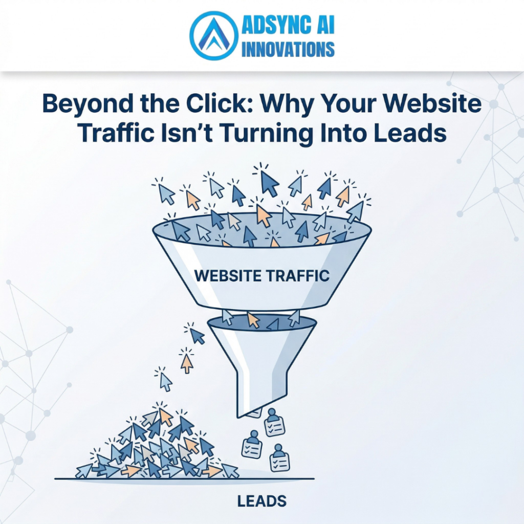
There is nothing more frustrating than paying for traffic that doesn’t convert. It is what we call the “Leaky Bucket” syndrome. You are pouring water (traffic) into a bucket (your website), but because there are holes everywhere, you aren’t retaining anything.
Getting people to click your link is only 50% of the battle. What happens after the click is what actually pays your bills. Here is why your website visitors are bouncing, and how to plug the leaks to turn that traffic into paying clients.
TL;DR: The Quick Takeaways
- Clarity Beats Cleverness: If a user cannot figure out exactly what you do within three seconds of landing on your site, they will leave.
- Stop Hiding Your Phone Number: Make it impossibly easy for people to contact you. A buried “Contact Us” page kills conversions.
- Cut the Form Friction: If your contact form asks for 12 different pieces of information, you are scaring away warm leads.
- One Page, One Purpose: A landing page should guide the user toward a single, specific action, not overwhelm them with 50 different clickable options.
1. You Are Failing the “Three-Second Rule”
Human beings have notoriously short attention spans online. When someone clicks a link and lands on your homepage, you have roughly three seconds to answer three subconscious questions:
- Where am I?
- What can I do here?
- Why should I care?
If your website opens with a vague, clever headline like “Innovating the Future of Tomorrow,” the user has no idea what you actually sell. Are you a software company? A financial advisory firm? A logistics provider?
The Action Step: Rewrite your main headline (the hero text at the very top of your site) to be brutally clear. If you provide international sea shipping and freight logistics, say exactly that. Tell them what you do and who you do it for, immediately. Clarity always wins over cleverness.
2. Your Navigation is a Maze
Imagine walking into a massive grocery store where none of the aisles is labelled, and the milk is hidden behind the hardware section. You would walk right back out.
Users do the same thing on confusing websites. If a patient is visiting a hospital’s website looking for a specific specialist or trying to book an appointment, they should not have to dig through five drop-down menus to find it. If a business owner needs to know if your tax firm handles GST filing, that information should be front and centre.
The Action Step: Simplify your main navigation menu. Limit it to 5-7 essential links. Put the most important information right in front of them, and use your footer for the less critical pages (like Privacy Policies or generic About pages).
3. Your Call-to-Action (CTA) is Weak or Invisible
If you want people to take an action, you have to tell them to take it explicitly.
A tiny, grey “Submit” button at the very bottom of a 2,000-word page is not a Call to Action. Hoping the user will eventually stumble upon your phone number is not a strategy. You need high-contrast, action-oriented buttons that tell the user exactly what will happen next.
The Action Step: Change your button colours so they pop off the screen. Upgrade your button text from boring words like “Submit” or “Click Here” to value-driven phrases like “Get Your Free Estimate,” “Book a Consultation,” or “Speak to an Expert Today.” Place these buttons strategically throughout the page, not just at the bottom.
4. There is Too Much “Form Friction”
You finally convinced a visitor that you are the right company for the job. They click “Contact Us” and are suddenly faced with a massive form demanding their first name, last name, phone number, email address, company name, annual revenue, and blood type.
Every extra field you add to a contact form drastically lowers the chance that someone will actually fill it out. This is called form friction.
The Action Step: Ruthlessly cut down your contact forms. What is the absolute minimum amount of information you need to start a conversation? Usually, it is just a Name, Email, and a brief Message. You can gather all the other details during your first phone call or email exchange.
5. Your Website Lacks Social Proof
In the digital age, nobody wants to be your first customer. If a visitor arrives on your landing page and sees no reviews, no case studies, and no client logos, their trust drops to zero.
People look for validation from others before making a purchasing decision. If you are a B2B service provider and you aren’t showcasing the incredible results you’ve achieved for past clients, you are forcing the user to take a blind leap of faith.
The Action Step: Scatter social proof throughout your entire website. Don’t just hide reviews on a dedicated “Testimonials” page. Put a glowing client quote right next to your contact form. Add logos of companies you’ve worked with directly under your main header.
Stop Paying for Traffic That Doesn’t Convert
Driving traffic to a poorly optimised website is like throwing money out the window. Before you spend another dollar on Google Ads or SEO, you need to ensure your website is engineered to turn those clicks into cash.
Ready to plug the leaks and double your conversion rate? The team at Adsync Marketing specialises in data-driven website design and conversion rate optimisation that turns passive readers into paying clients.
- Call us: +91 93802 22322
- Email us: info@adsyncmarketing.com
- Visit: https://adsyncmarketing.com/