You have spent thousands of Rupees driving traffic to your website. Your design is flawless, your copywriting is engaging, and your product is genuinely great.
But when you look at your analytics, you see a terrifying trend: visitors are reading your pages, scrolling all the way to the bottom, and then simply leaving. They aren’t clicking your buttons. They aren’t filling out your forms. They are ghosting you.
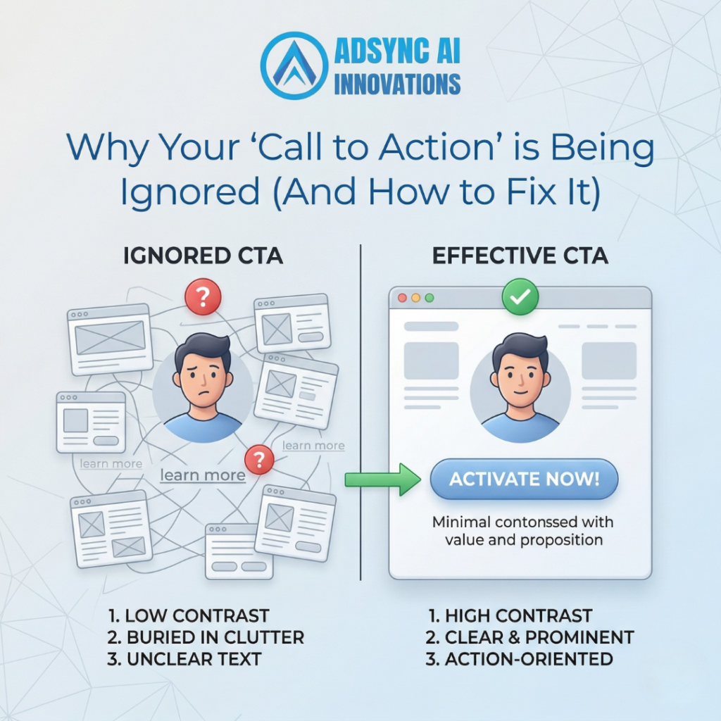
In the digital marketing world, your Call to Action (CTA) is the most important element on your page. It is the tipping point where a casual reader becomes a paying customer. If your CTA is weak, confusing, or invisible, all of your marketing efforts are essentially going to waste.
If your website feels like a leaky bucket, your buttons are likely the culprit. Here is why your Call to Action is being completely ignored, and exactly how to fix it today.
TL;DR: The Quick Takeaways
- Blend In, Miss Out: If your button is the same color as your website’s background, users won’t even realize it is clickable.
- “Submit” is a Conversion Killer: Generic, robotic button text creates zero excitement or urgency.
- The Paradox of Choice: Giving a user five different things to click on a single page usually results in them clicking nothing at all.
- Match the Commitment Level: Asking someone to “Buy Now” on a high-ticket B2B service before they even know you is too aggressive.
1. The “Chameleon” Button
The absolute fastest way to kill your conversion rate is to make your buttons blend into the rest of your website.
Imagine you are running a SaaS (Software as a Service) company. Your brand colors are navy blue and white. Your website background is white, your text is navy blue, and your “Book a Demo” button is also navy blue.
To a user scrolling quickly, that button doesn’t look like an actionable step; it just looks like another design element. We call this the Chameleon Button.
The Action Step: Your CTA needs to aggressively stand out. Use the “Squint Test.” Lean back from your monitor and squint your eyes so the page gets blurry. If you cannot immediately spot exactly where you are supposed to click, your button color needs to change. Use a high-contrast complementary color—like a bright orange or a vibrant green—specifically reserved only for your actionable buttons.
2. Vague and Robotic Copy
Take a look at the buttons on your website right now. Do they say things like “Submit,” “Click Here,” or “Learn More”?
These words are conversion killers. They are boring, they offer zero value, and quite frankly, the word “Submit” feels like a chore. People don’t want to submit; they want to receive a benefit.
Your CTA copy should clearly explain the specific value the user is going to get by clicking that button.
The Action Step: Change your button text from a passive command to an active benefit.
- Instead of “Submit,” use “Get My Free Estimate.”
- Instead of “Learn More,” use “Show Me How It Works.”
- Instead of “Sign Up,” use “Start My Free 14-Day Trial.”
A great rule of thumb is to start your button copy with a verb that implies a positive outcome.
3. You Are Inducing “Decision Paralysis.”
When a user lands on a specific landing page or a blog post, what is the one thing you want them to do?
Many business owners get greedy. They want the user to follow them on Instagram, sign up for their newsletter, read their latest press release, and buy their product. So, they put five different CTAs on a single page.
In psychology, this is known as the paradox of choice. When you give a human being too many options, they become overwhelmed and do not decide at all.
The Action Step: Every page should have one primary goal. If you are running an ad for a home plumbing service, the landing page should only ask them to do one thing: “Call an Emergency Plumber Now.” Remove the social media links, remove the newsletter sign-up, and eliminate any distraction that takes them away from that primary goal.
4. The “Commitment Phobia” Mismatch
You have to align your Call to Action with the psychological state of your buyer.
If you are an e-commerce brand selling a ₹500 t-shirt, a “Buy Now” button works perfectly. It is a low-risk, impulse purchase.
However, if you are selling a ₹2,00,000 enterprise software package, a “Buy Now” button on your homepage is going to scare people away. Nobody buys a massive B2B solution on an impulse. The commitment level of the button does not match the reality of the sales cycle.
The Action Step: Map your CTA to your sales funnel. For high-ticket items, lower the barrier to entry. Instead of asking them to buy immediately, use softer commitments like “Book a Strategy Call,” “Download the Industry Report,” or “See a Live Demo.”
Tell Them Exactly What to Do
Your customers are busy, distracted, and overwhelmed. They do not want to hunt around your website to figure out how to give you their money. You have to take them by the hand and confidently lead them to the next step.
If your website has traffic but no traction, it is time to stop hiding your buttons.
Is your website leaking potential revenue? Don’t let your marketing budget go to waste. The team at Adsync Marketing specializes in Conversion Rate Optimization (CRO), redesigning user experiences to turn your passive readers into active buyers.
- Call us: +91 93802 22322
- Email us: info@adsyncmarketing.com
- Visit: https://adsyncmarketing.com/